What inspired you for this map?
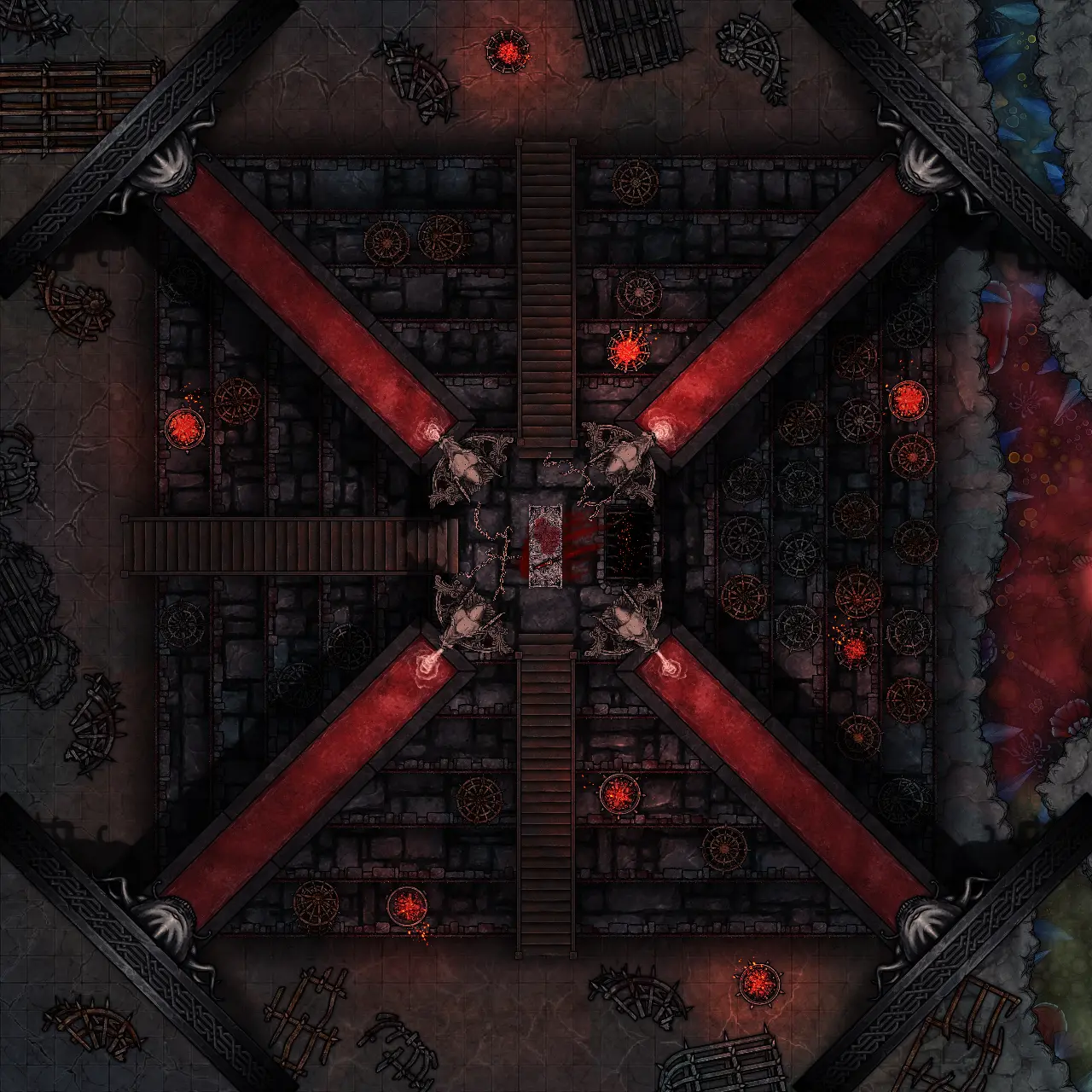
I was leaving on vacation the day after I saw the contest announcement and new assets, so I knew I had to create something relatively quick: A boss fight! Inspired by the Stranger Things theme of the contest, I arranged this map as the final approach to fight Vecna. To further tie it to the show and make the villain of the map more menacing, I designed the map as a poster to showcase the boss monster in a way most battle maps don’t utilize. I also felt the disjointed way the map shifts from overhead to abstract boss room was a fun nod to the way the characters in the show had to climb through the ceiling and fall to the floor - making for some other worldly physics.
What did you learn while creating the map?
I learned there are countless ways to use all of the tools available in the map editor - combining assets, resizing assets, color grading, painting with a variety of colors, using assets in unintended ways and so on - to create wild and fresh takes on designing battle maps. I can’t wait to make more!
What tips can you give to create creepy mood in maps or stories?
To me, creepiness is about two things: subtlety and lighting: finding little scenes - within the larger map - which suggest ‘something’ out of the usual has happened here through an assortment of props. And of course, Dungeonfog’s Battlemap Editor has sooooo many wonderful ways to utilize lighting and coloring for creating a variety of mood and tension.